Interaction design from multiple perspectives

Dan Saffer introduced an interesting fact in interaction design in his book Design for interaction. The goal of interaction design is to design possible interactions for users to accomplish their goal or product or service. The interactions have to fit the time and context of the product.

Even the goal of interaction is the same, different designers might do it in many different ways depending on their experiences. One factor affecting their design is their perspective toward the design project.

Saffer suggested three perspectives.

1. Technology-centered view – designing interactions for the raw product created from software engineer or programmers in order to create good user experience.

2.Behaviorist view – designing the behavior and feedback of the product to serve the needs of the user. The focus is on the function and the feedback.

3.Social interaction design view – designing interaction between people that use the product regardless of the number of device or type of device they use. The focus is on the communication between people.
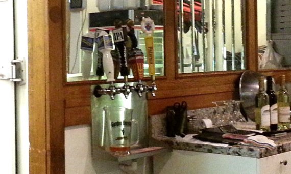
Good Design: Beer Dispenser

Beer Dispenser

Beer Dispenser

I found this beer dispenser when I was during a vacation in California. It was in a restaurant that also provide alcoholic beverage to customers.

The designer well considered both the usability and the aesthetic of the dispenser. The size and the position of the handled hint the user that he has to operate by hand. The spaces between handles give the sense of direction to operate. These two are quite common in this kind of appliance.

However, special characteristic of the dispenser that I would like to point out is the appearance of the handles. Shape and colors of each handle represent the brand of the beers. For sure, one reason is beauty. Another reason may be marketing. Moreover, from the usability point of view, the different shape of the handles also prevents user from mistakes. The user who frequently use the dispenser can easily find out if he wrongly pick a handle by the feeling from his hand. He will notice the error before he actually operate it. The different of shape of handles is also applied for equipments in operations that mistakes are unacceptable such as power plants.


Faces in Designs

If a picture is worth a thousand words, a picture of a face is worth more than that! The article “The Power of Faces in User Experience” pointed out that a picture of a face can convey more than the meaning of the object itself. A face can be used to encode implicit messages of emotions, which most humans are familiar with the interpretation of those messages. It would be great for designers to implement images of faces with proper implicit message to enhance their design.

Besides the capability to encode messages, faces are good to attract human eyes. There is a human nature that we can easily recognize faces. Faces in this case are not only a real faces of human or animal, but also the combination of things that looks like a face. So, in a design, faces can be either a good attractive spot or great distraction. The designers have to pay attention to those faces in their design. Moreover, a designer can use the orientation of a face to induce viewer to pay attention to certain direction.

How to completely merge your design with the existing products

When you design a product as a new part of the existing one for an organization, your design may not completely merged as it should. The article “Fixing A Broken User Experience” proposes five-step strategy to make sure that your design is smoothly blended with the existing product. The strategy is backward comparing to ordinary steps in design. However, the writer claims that it leads to the best user experience.

Breakthrough ideas: Sleeping bag

Zippered Vents Sleeping Bag

Normal sleeping prevents a user from changing sleep posture. However, there was a cool idea that eliminated the limitation. The Zippered Vents Sleeping Bag allows a user to personally adjust sleep posture. With the vertical zips along the bag’s length, a user can open or close each zip to suit his/her own need. The user can even close all zips for a normal sleeping bag. This is a product with a great idea of flexibility, which enables better user experience.

Breakthrough ideas: Mobile business application without coding

Usually, people in business word have no programming skills, but they have good understanding of their own business. They know exactly what kind of mobile applications they want. The only thing they need is a tool to create the desired applications.

The idea of creating mobile applications without coding is a great idea for them, especially people that have small businesses. Business owners can use the combination of basic interactions such as clicks and drag and drop to create mobile applications. Those people do not need technical knowledge. Things they need are good design of the application and understanding of data. Then, those people can create the product by themselves saving time and budget.

Bad Design: A coffee cup

Coffee cup

This cup was a kind of creative work. The shape of the cup is interesting, which may positively impact on user’s emotion. However, the cup may create poor user experience. The edge of a cup affects direction of the drink inside. With this wavy edge, a user could split the drink easily because of multiple flows of the drink generated from each curve. This cup shows us that the beauty of the design is useless if the product cannot fulfill user’s goal.


Class reflection: Usability testing presentation

The presentation today about the usability testing of the CGT graduate website was very interesting. Even though every group did the usability testing on the same website, we got different quantitative results within an acceptable range. In my opinion, the differences of the results came from differences of samples and those small details in methodology. My group did the test on both graduate and undergraduate students as well as both native and international students while some group focused on some of them. In the usability test, my group performed on Google Chrome, which did not display some page perfectly, while other groups may not. All those details may be factors that we have to consider when we do usability testing. However, obviously, I noticed that the presentation skill of everyone did improve. Good job!

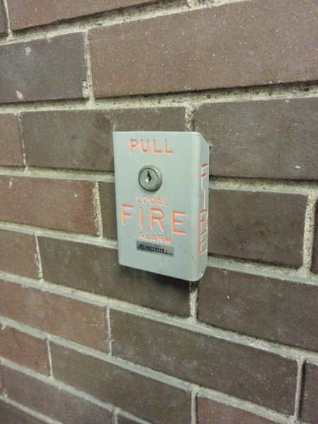
Bad Design: A fire alarm box

2012-12-05 21.33.32

I found this fire alarm box on a wall in a library. Actually, I passed thought that way quite often, but I did not notice if it was there. I realized that it is a bad design because a user will take time to find it when s/he needs it, in emergency situations. In my opinion, the problem is the color, which is not attractive and too similar to the color of the wall.

Then, I considered how to use this fire alarm box. It took me a while to figure it out. Even then, I am not sure where should I pull, the top or the bottom. The keyhole convinced me to think that the box was nailed to the wall at that position. Certainly, I don’t want to test it. I am not sure if there was a psychological reason behind the design to prevent unintentional actions. However, in general, I would consider this fire alarm box as a bad design because of the poor affordance.

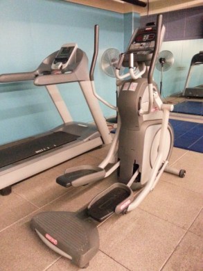
Good Design: An exercise machine

During the holiday, I visited an exercise room. I found an exercise machine that was really impressed me. There was no user manual in the room. However, when I saw the machine, I can correctly guessed how to use it. There were two footing that I should place my feet on, and there were two handles that I should catch with my hands. The affordances for the machine were so clear. Then, I tried to move my feet and arms. I found that the machine response with the red letters feedback on the display. The machine asked me to select an exercise program with the quick button, which I saw it on the bottom left. Even I ignore the feedback and keep moving without choosing any program, the machine automatically select the standard program for me, which display the time and heart rate. The machine was so user-friendly even with a user with less experience with this kind of machine like me.

Social Media Matters

A blog about social media and higher education

Of Tweets, Pokes, & Wikis

a blog about social media

Dede Frederick's Blog

There's nothing new under the sun

It EcoSocial NetWorld

Sustainably Happy

Behind the Scenes with Kate

This WordPress.com site is the bee's knees

Eli Allameh

"Be the change you wish to see in the world."- Mahatma Gandhi

#/blog/strahmb

Thoughts about UI/UX, Front-end development, and Social Media

Architectural Hum

Contemplating the Din of Design

Adam J Stark

A life less ordinary.

Professor Lunar

Rocket Ship Builder, Futurist

dougpruim

Socially Mediated

EMMA DONG

Always on the road.

Blog, Tweet, Learn

Dr. V's teaching blog

intuinno by Deok Gun Park

intuinno means intuitive innovation by Deok Gun Park

CGT 512

Human Factors of Computer Interface Design

CyberSecurity et al

A fine WordPress.com site

stewart_simpson

UxD for Engineering and Manufacturing Software

UX & Me

UX and everything UX related in my world!

PORSCHE OH

THIS BLOG IS A WORK OF NONFICTION, ANY RESEMBLANCE TO FIGURES OR EVENTS PAST OR PRESENT IS PURELY INTENTIONAL.

Jack Chang on HCI

"We make things talk so we can talk to people."

akarambo

4 out of 5 dentists recommend this WordPress.com site

Nick Rohe

Some thoughts on some designs.

cgt512sw

A topnotch WordPress.com site

Katie Cissell

UX & Product Designer

Name your α

How do you explain to children that you're "in 20th grade"?

Use It With Eddy

Us-ability Start with Us

Dylan's HCI Blog

"You can't just ask customers what they want and then try to give that to them. By the time you get it built, they'll want something new." - Steve Jobs (1955-2011)

Carol's blog

Everyone should take action with a dream and be strong with a reason